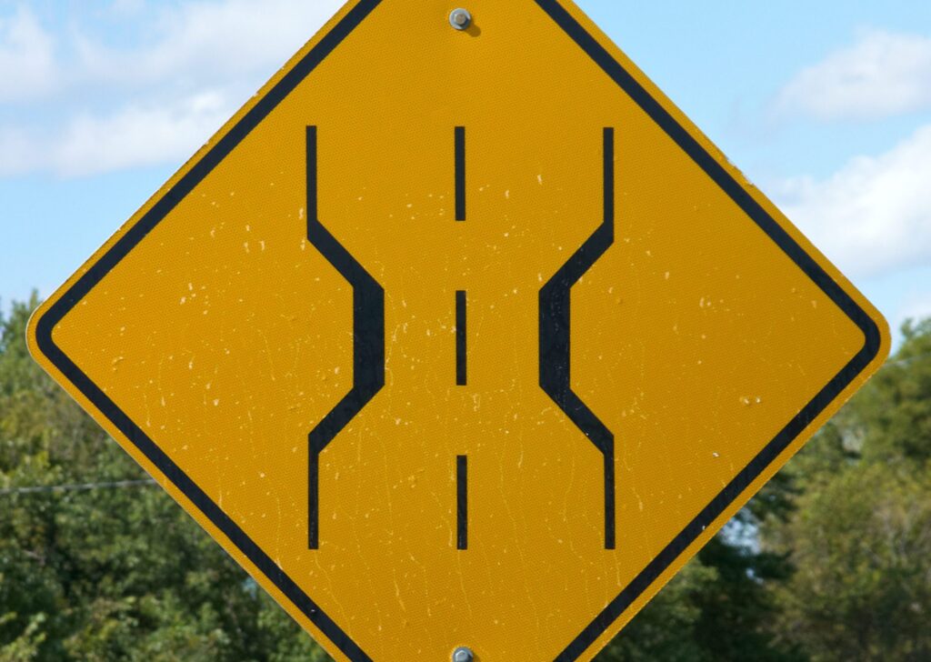
Traffic management signs are a great way to convey potential harms or safe courses of action on site. However, not all traffic management signs are equally efficient because they don’t possess the ideal qualities to serve their purpose.
Keep outstanding qualities of good traffic management signs in mind to ensure that they serve their purpose well on-site and ensure the safety of workers.
The following can be the reasons for poor efficiency of signs:
- Poor Placement
- Poor visibility
- Uncommon signs that workers do not understand
- Poor Color Contrast
Now let’s explore the qualities of ideal traffic management signs
1-Right Placement
Traffic management signs must be placed at a place where they are visible to the people who must be aware of information on it. Mainly, corners or side placements are poor to place traffic management signs.
For instance, if cement is being mixed in a machine, the sign must be placed as a barrier between a pathway that leads to the machine to ensure everyone sees the sign before encountering the cement mixer.
2- Right Size
Having a sign placed on site does not mean that your responsibility is over. If the sign that you have placed on the site is too tiny to be visible, it will not save you from a sued if any site accident occurs.
Traffic management signs must be visible to be easily noticed by every vehicle coming. Placing a tiny traffic management sign will not fulfill its purpose. Moreover, there is no sense of placing a sign inappropriate in size as it is as bad as not having a warning sign at all.
You can evaluate the right sign size on the following standards:
- The right size of the board
- The correct height of the board
- The right size of symbol or information mentioned on board
3-Right Color and Visibility
Colors are a helpful way of gaining attention. Most traffic management signs are bright red, blue, yellow, or neon in color. If work continues at night on your worksite, make sure that signs are of material that shines at night to be easily visible.
Choosing dim colors or insufficient color contrast will affect the visibility of that sign. Imagine you have a yellow sign on a blue board then it will require extra attention to view and understand the sign.
Board must always be of brighter and attention-catching color, and the sign must mostly be in black, so it is visible even to people with minor visual disabilities.
Signs provided by Capital Traffic safety meet the quality as mentioned above standards to ensure site safety. You can contact them for site traffic solutions as well.

